







Tips for Choosing Calm Colors for Your Home
Creating a peaceful and inviting environment at home often starts with the colors you choose for your walls and décor. Calm colors can help reduce stress, promote relaxation, and make your space feel warm and welcoming. Whether you’re redecorating a single room or your entire home, selecting the right calm colors is an important step.
In this post, we’ll explore helpful tips for choosing calm colors that perfectly suit your space and style.
Why Choose Calm Colors?
Calm colors are soft, muted shades that tend to be gentle on the eyes and evoke a sense of tranquility. These colors often include:
– Soft blues
– Light greens
– Warm neutrals like beige or taupe
– Pale pinks and lavenders
– Cool grays
Such tones can make a room feel more spacious, peaceful, and balanced. Calm colors are ideal for bedrooms, living rooms, bathrooms, and any space where you want to unwind.
Tips for Choosing Calm Colors for Your Home
1. Consider the Room’s Purpose
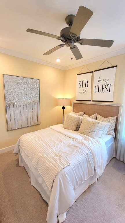
Start by thinking about the function of the room. Bedrooms benefit from soothing blues, greens, or soft lavender, which encourage restfulness. Living rooms might feel cozy and inviting with warm neutrals or gentle peach tones. Bathrooms can feel fresh and clean with soft blues and greens.
Choosing a color that matches the room’s purpose will make it easier to create the right mood.
2. Look at Your Lighting
Lighting plays a major role in how colors appear. Natural light shows true colors, while artificial lighting can change shades noticeably.
– Natural light: Rooms full of daylight work well with cooler tones like soft blues and greens.
– Warm light bulbs: These can enhance warm neutrals, soft yellows, and creamy tones.
Observe your space at different times of the day to see how light affects color before making a decision.
3. Use Neutrals as a Base
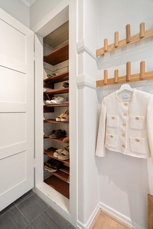
Neutral colors such as off-white, beige, light gray, or taupe are excellent choices for calm spaces. They provide a quiet backdrop and pair beautifully with soft pastel accents.
Neutrals allow flexibility if you want to switch up accessories or artwork later on without having to repaint often.
4. Choose Colors With Low Saturation
Calm colors are generally less intense and more muted. Instead of bright or highly saturated hues, opt for shades with subtle tones that are easy on the eyes.
For example, instead of bright turquoise, choose a soft teal. Instead of vivid pink, try a pale blush.
5. Test Samples Before Committing
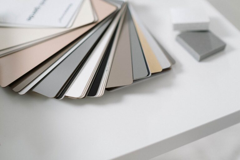
Paint colors can look very different on a small chip compared to a full wall. Always test a few samples on your walls and observe them under different lighting conditions.
Paint large swatches or use sample boards you can move around, and live with them for a few days before deciding.
6. Think About Color Pairings
Combine calm colors with complementary shades to add depth and interest. Here are some soothing combinations to consider:
– Pale blue with soft gray
– Warm beige with dusty rose
– Light green with creamy white
– Lavender with soft taupe
Using two to three calm colors in a room can create a balanced and harmonious look.
7. Incorporate Texture and Patterns
Sometimes a calm color palette can feel flat if there’s no variety. Use textures and subtle patterns in fabrics, rugs, or wallpaper to add warmth and visual appeal.
For example, a soft gray wall paired with textured cushions or a patterned throw will keep the room feeling inviting without overwhelming the calm atmosphere.
8. Don’t Forget About Accent Pieces
If you love calm colors but want a bit of contrast, add small pops of color through accessories. This might include cushions, artwork, plants, or candles in slightly deeper or complementary shades.
Accent pieces are easy to change and allow you to update your space seasonally or whenever you want a quick refresh.
Popular Calm Colors to Consider
Here are some calming colors that have proven popular in home design:
– Soft Blue: Evokes serenity and clarity, great for bedrooms and bathrooms.
– Sage Green: A natural, earthy tone that promotes relaxation.
– Warm Taupe: Neutral yet cozy, ideal for living rooms and kitchens.
– Blush Pink: Gentle and soothing, adds a touch of warmth.
– Light Gray: Modern and versatile with a cool, calm feel.
Final Thoughts
Choosing calm colors for your home can create a peaceful sanctuary where you feel comfortable and relaxed. Remember to consider the room’s purpose, lighting, and your personal preferences when making your choice.
Test different shades and combinations, and don’t hesitate to bring in texture and thoughtful accents to complete your look. With these tips, you’ll be well on your way to building calming, beautiful spaces that invite rest and comfort.
—
Feel free to share your own color choices or questions in the comments. Happy decorating!